WW International "E-Mail Capture" Test
To increase newsletter activity and broaden WW’s marketing capabilities, I was tasked with exploring different placements and design variations for e-mail capture modules. These modules will be tested in several parts of the .com site, internationally. Winning variants would then be implemented.

The Problem
Currently, a small an unnoticeable form input field can be found within the footer, which carries out as a global element across the .com pages. This is the only way of manually singing up for marketing materials from WW and is currently ineffective.
The Solution
Adding a unique incentive for the viewer to sign up for WW marketing materials. For example, while reading a recipe the viewer might be interested in receiving more recipe inspiration. This clarifies the value proposition for the viewer - “Why do I need to sign up? How does this benefit me?”.
Displaying the modules on specific pages with unique styling to match the content on the page. This continues the conversation between brand and the viewer helping to eliminate the display ad ‘feeling’ of the module > Food articles = food styling, Activity tips = activity styling, etc.
Using bold visual elements, like large imagery or bright colors, to highlight the modules across the pages.
Adding clear feedback states that confirm the subscription such as placement for disclaimer text (GDPR notices find a home here).
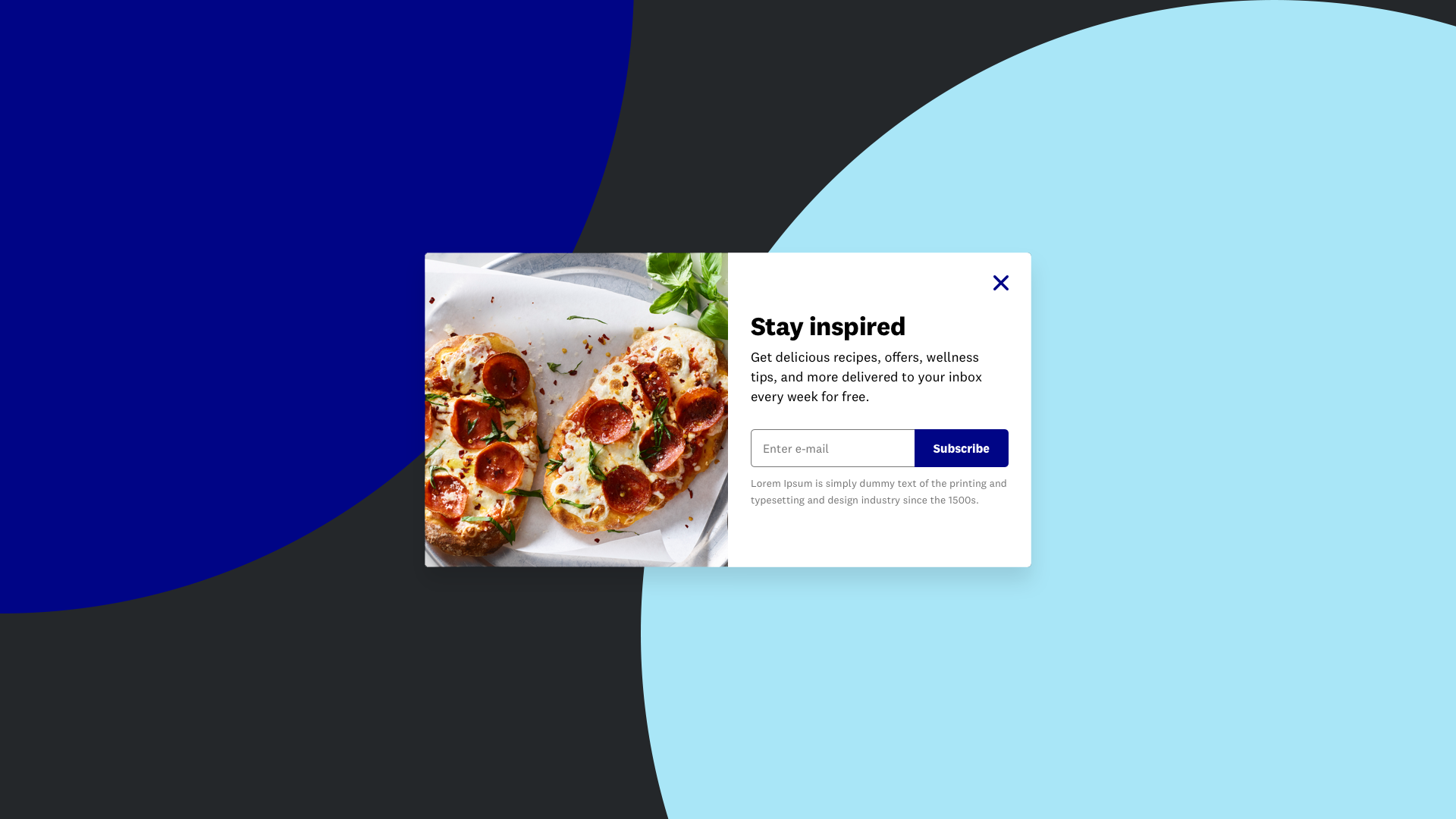
Fullscreen Module
Covers entire page, darkens background. Exit-able, fade in upon scrolling down combined with 5 second timer.


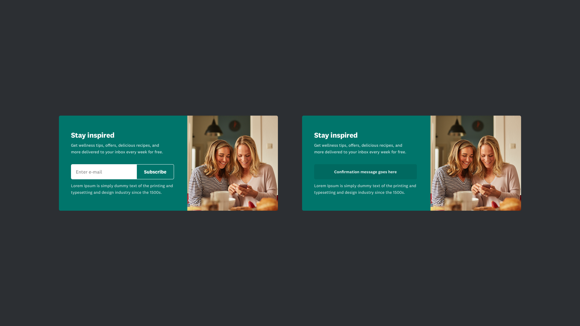
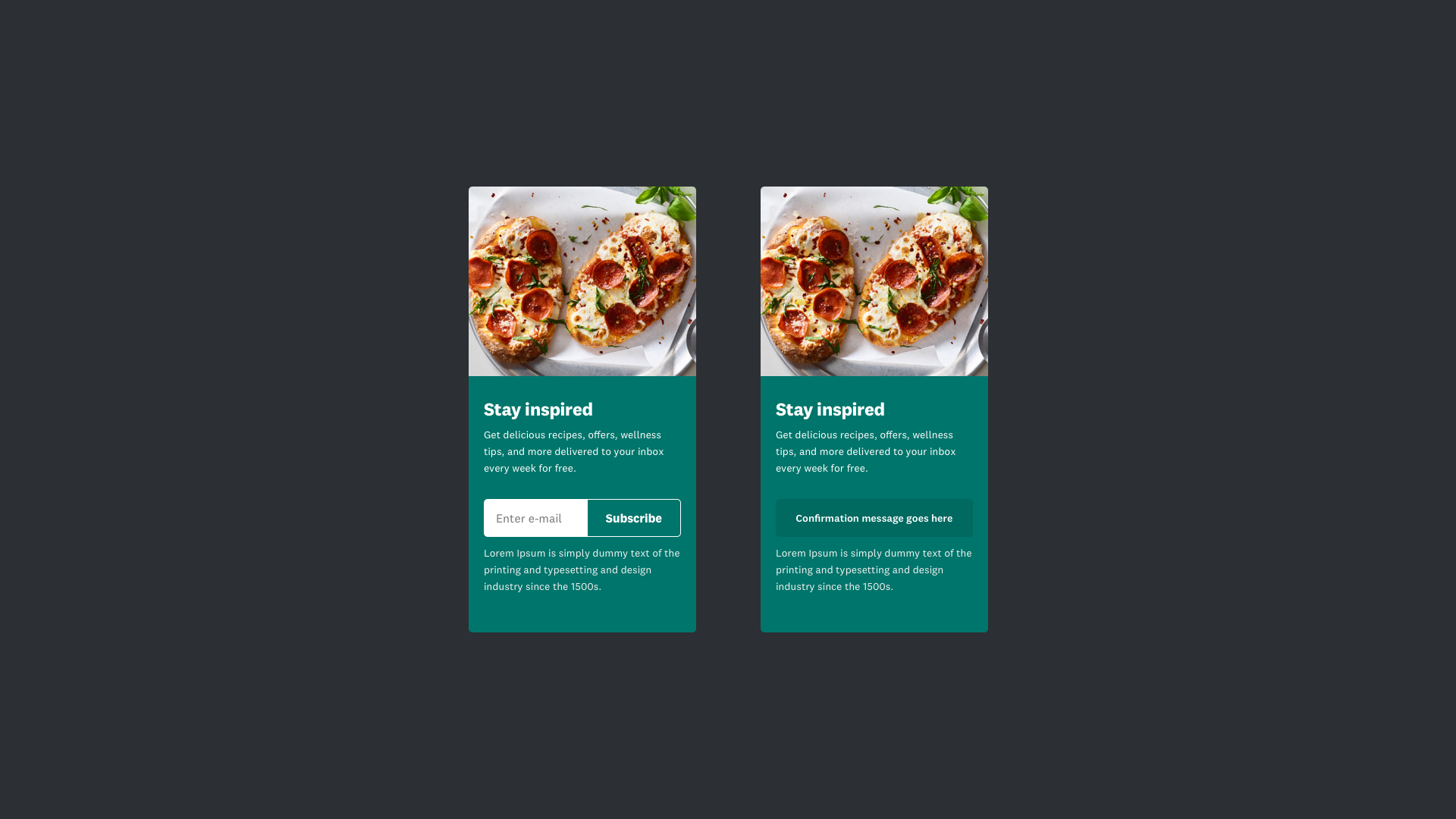
Article Module
Placed at the end of an article, blog post or feed item. Can also be used in between breaks instead of the end.

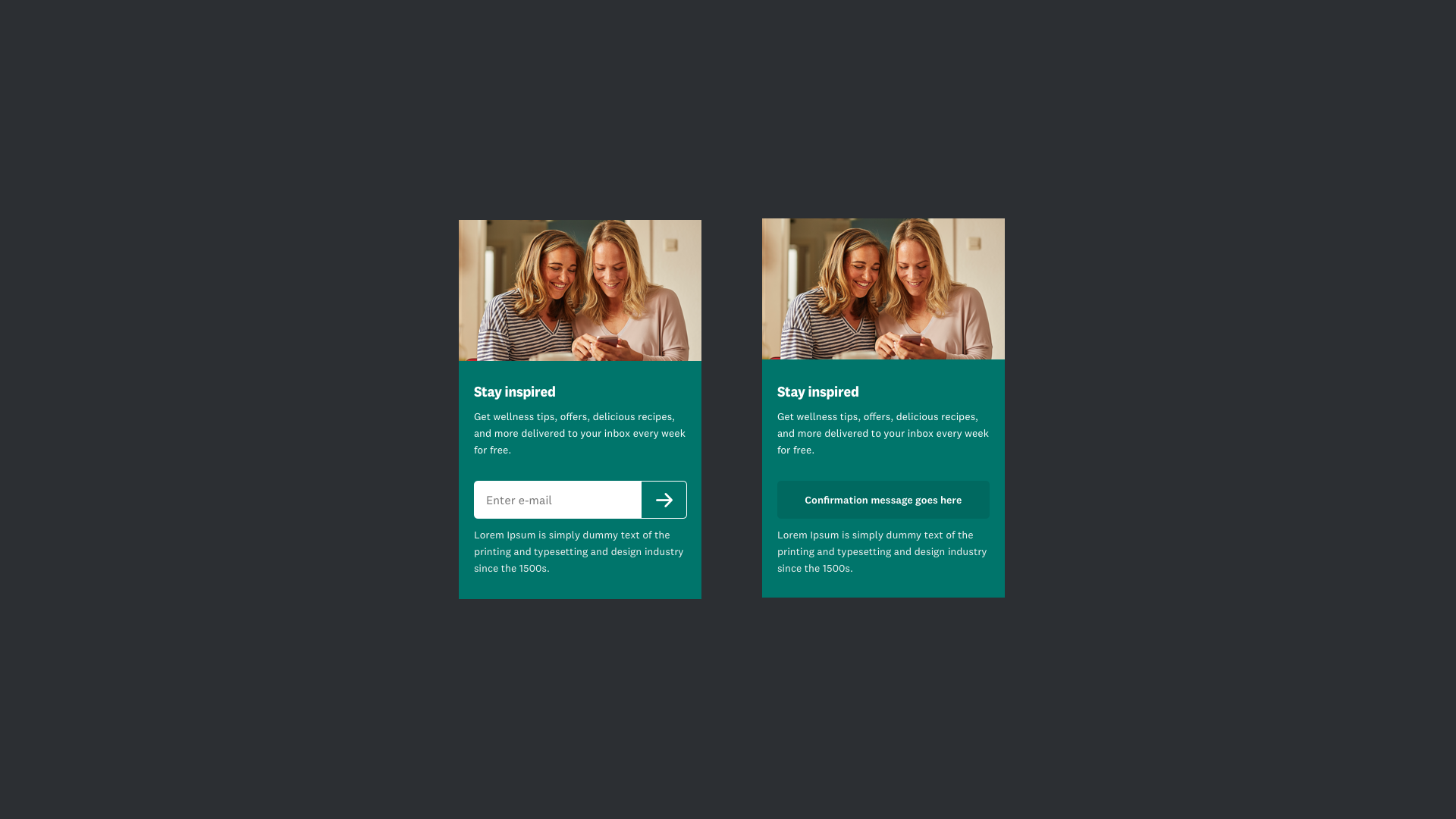

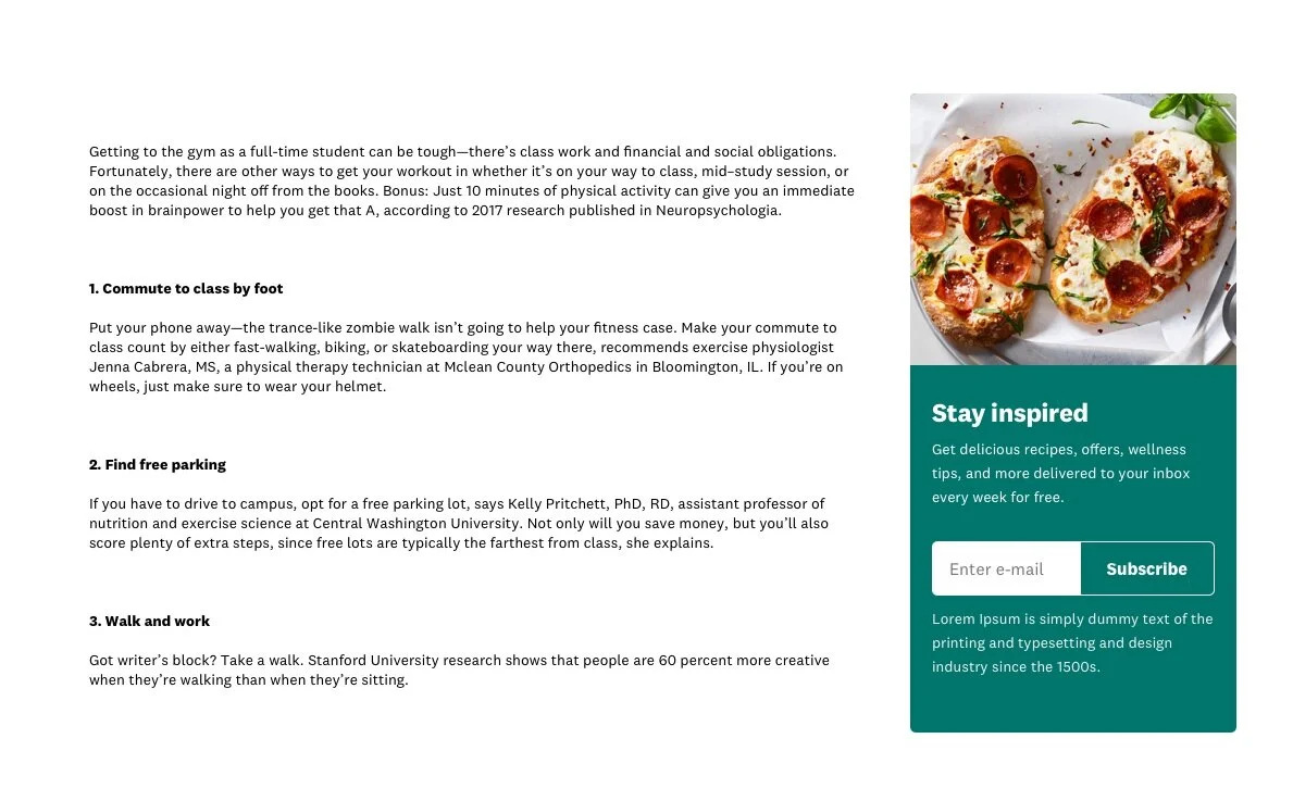
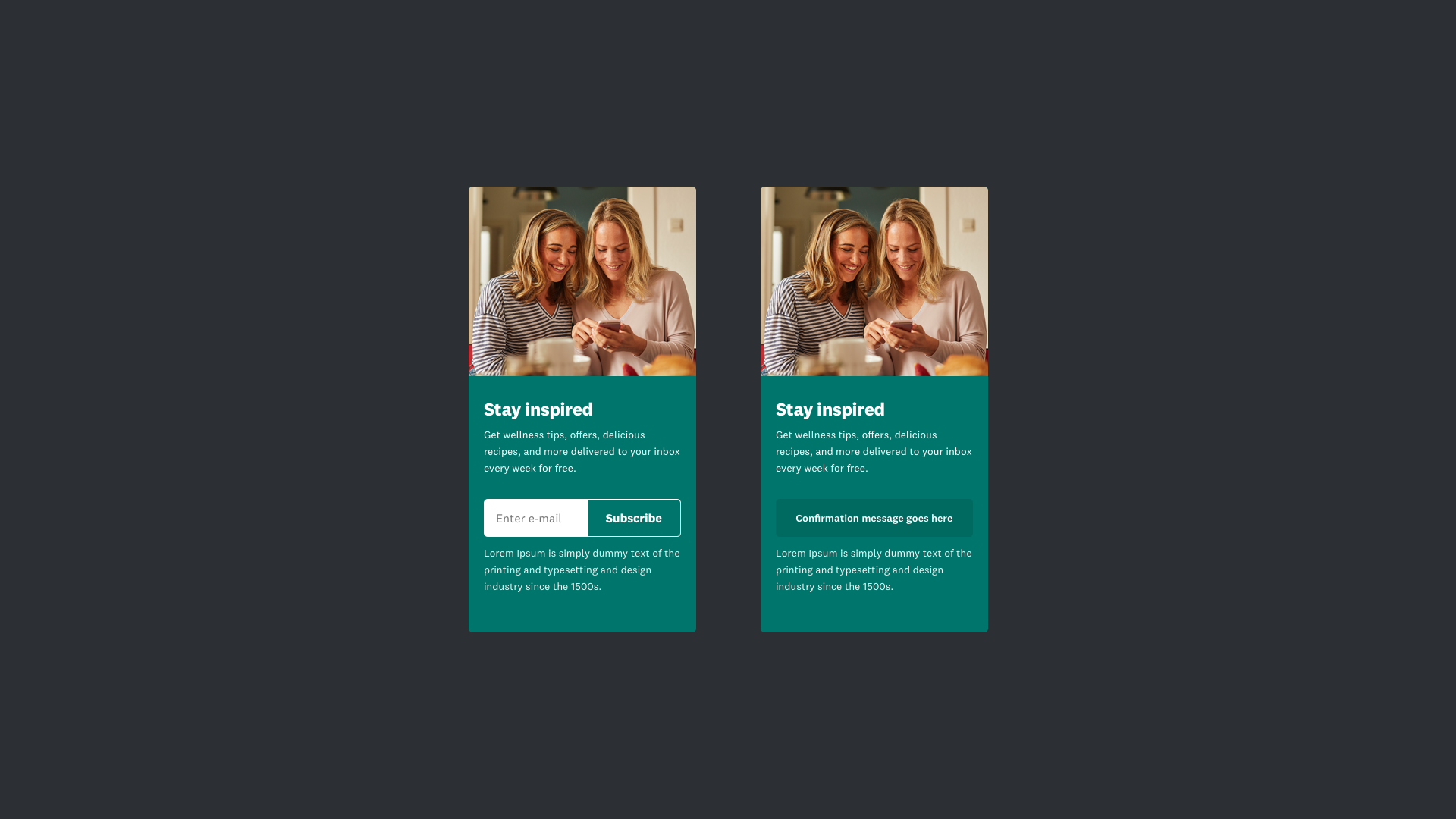
Side Rail Module
Sits in line with the content on the right-hand side. Module follows the scroll. Upon subscription confirmation, the module fades out and uncovers display ads.
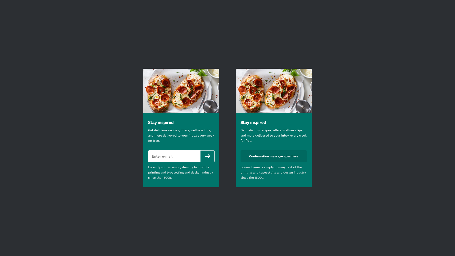

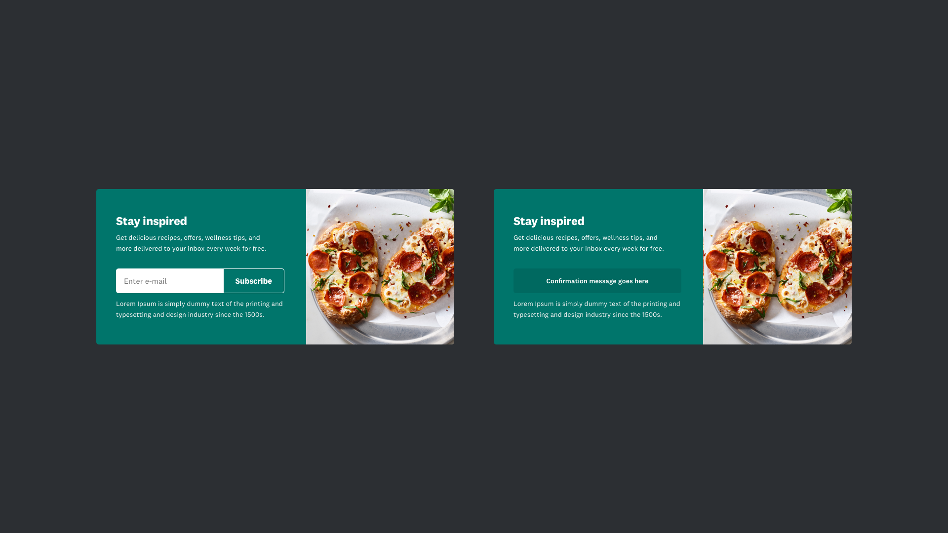
Recipe Card Insert
For food content modules only. At the end of a Recipe card, before Ingredients.

