Project 'GXP3' - Native Guest/ Experience for WW
GXP3
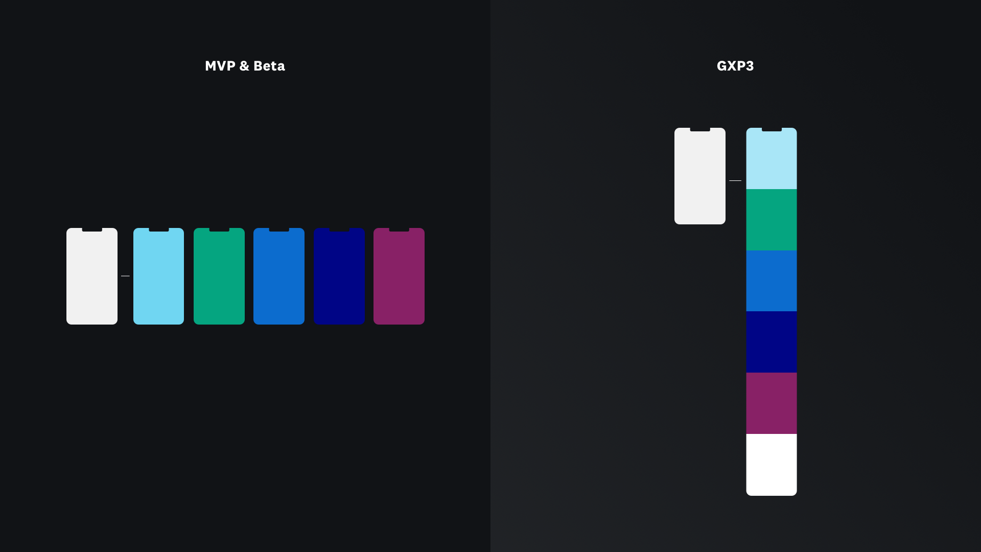
With the aim of enhancing the current Guest Experience on WW’s mobile app, launched previously, I was challenged with reacting to newly found data. Including Analytics, research findings and reviews of the initial product launch. In addition to taking newly collected data in consideration, the updates planned by the crew also allowed for further design intentions to be implemented. Supporting the reflection of new marketing materials and design goals that couldn’t executed due to prior timing constraints for the MVP launch.

Behind the project
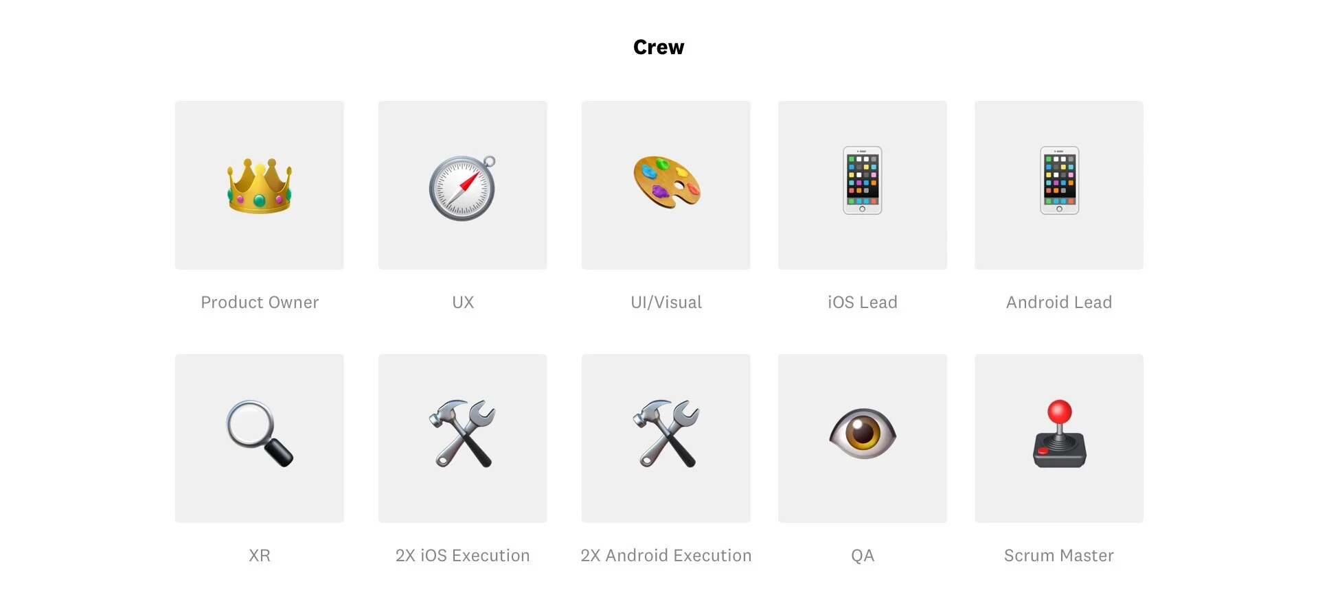
Continuing with the original team that has been assigned and worked on the MVP & Beta iterations of GXP.
Solution Proposal
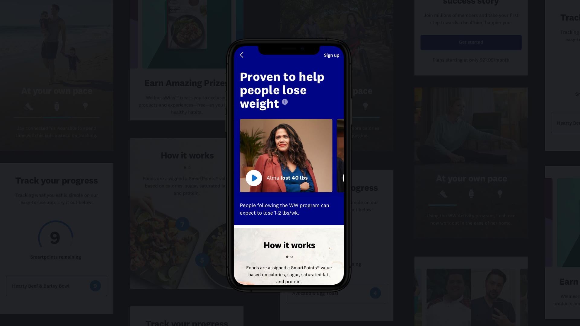
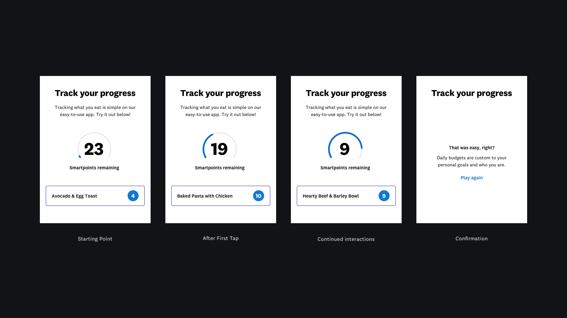
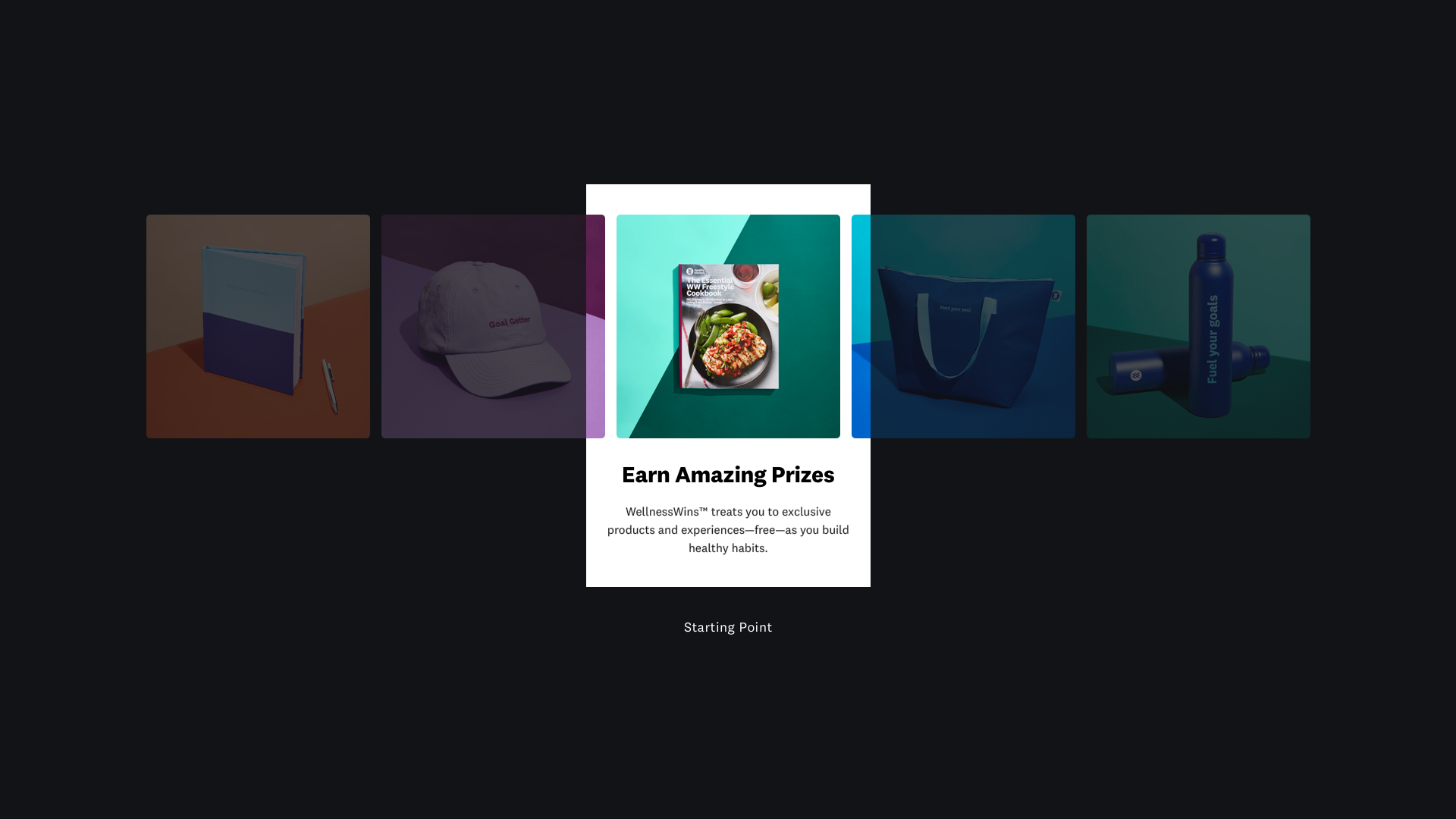
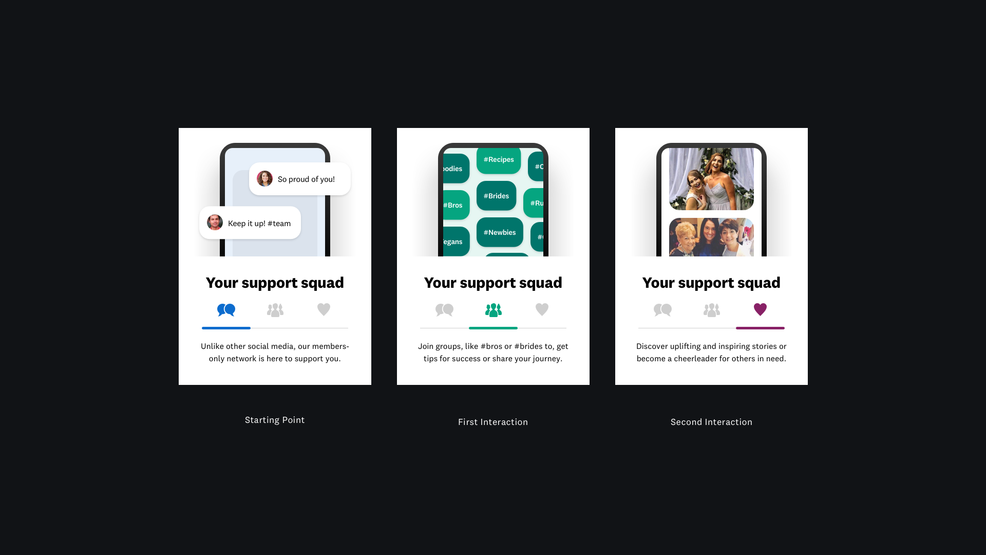
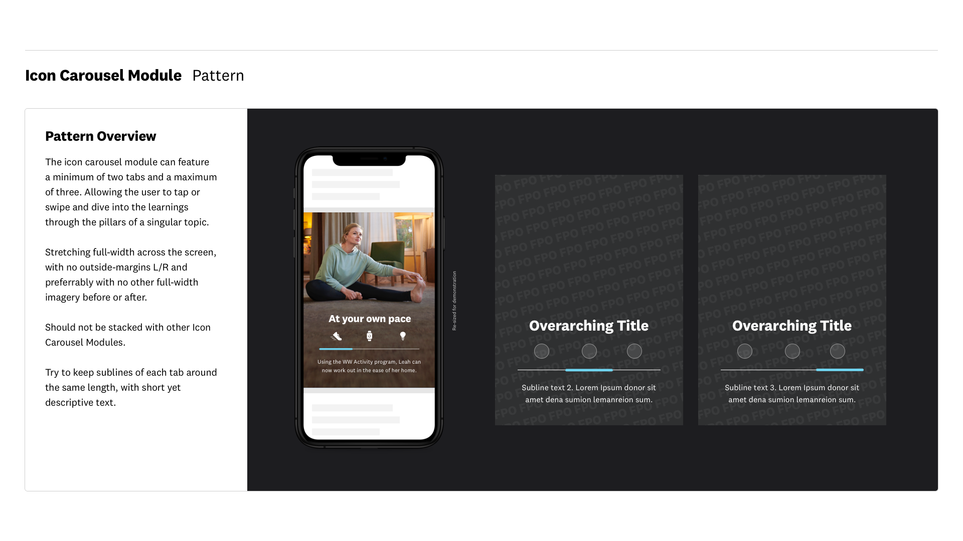
Simplified scannable single-page UX with optional learnings upon interacting with the content.
Modular ‘Learning Slices’ allow content to be swapped or updated very easily.
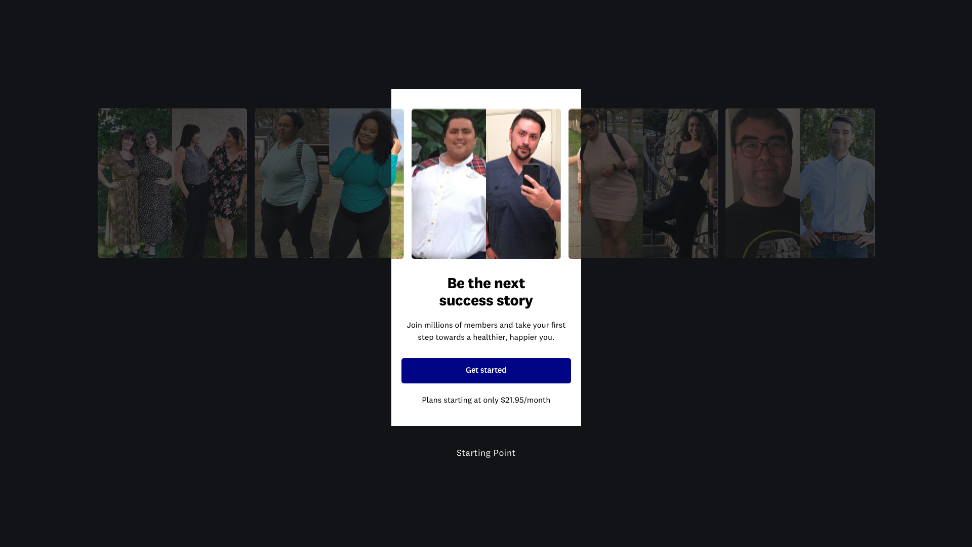
Non-branded language, testimonial driven and updated content to convey “Why” the program could work directly for the member.
Problem Statement
‘Funnel’-style UX could be a reason for drop-off before registration/ checkout area.
Adaptability to program or content changes requires design changes resulting in a lengthy process.
As per testing results, user comprehension could be strengthened for clearer learnings.
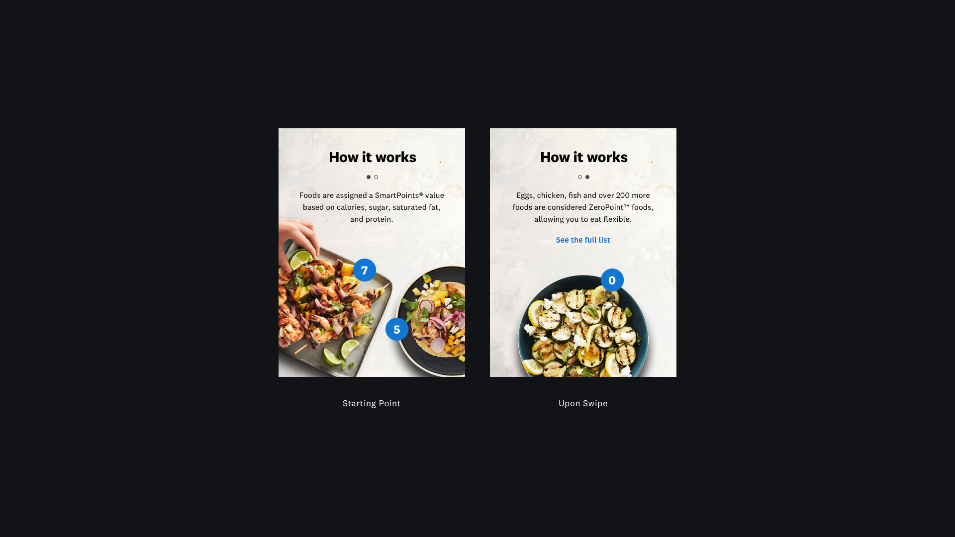
Proposed UX Update
Rather than using a pagination-flow to guide the viewer through the learning experience, we’ve opted for a single-page flow. This allows the viewer to easily scan the learnings and then dive deeper into each of the pillars if interested.
A closer look at the Design Patterns

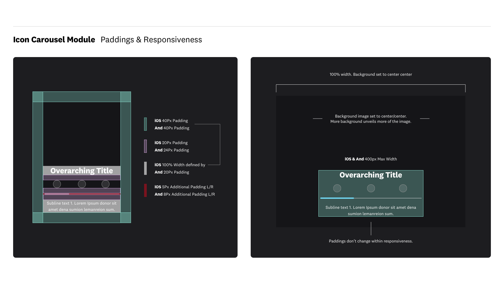
Pattern Introduction
Due to time & resource alignment constraints, I wanted to assure that the development and engineering process will go as seamless as possible. Hence why I decided to write and visualize guidelines on each of the patterns designed for GXP3. Take a closer look at how one of the patterns is being introduced to the team and company.


Prototyping
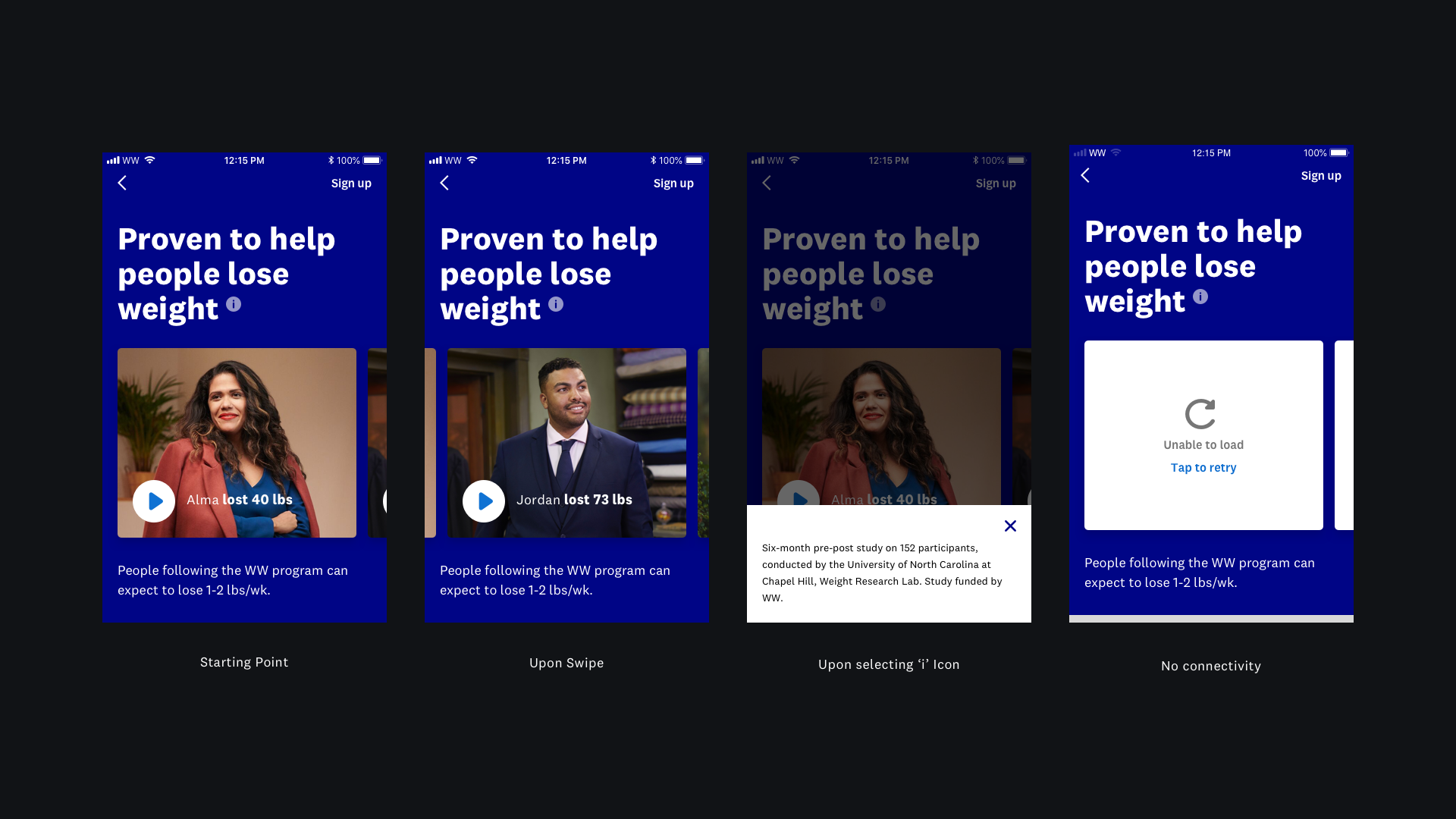
In order to collect accurate testing results on the UX flow, UI & Visual design such as overall product comprehension, I wanted to assure that we test with a Prototype that reflects exact interactions mirroring what we imagine launching. Previous Prototypes have been very limited and hard to interact with. InVision Studio allowed me to demonstrate the teams vision down to each pixel.
As this level of detail in a Prototype has been a first for WW, the team has decided to test with an additional crew I am also a part of. Meaning that we ran testing for GXP3 and a new In-App Purchase flow that go hand-in-hand.
